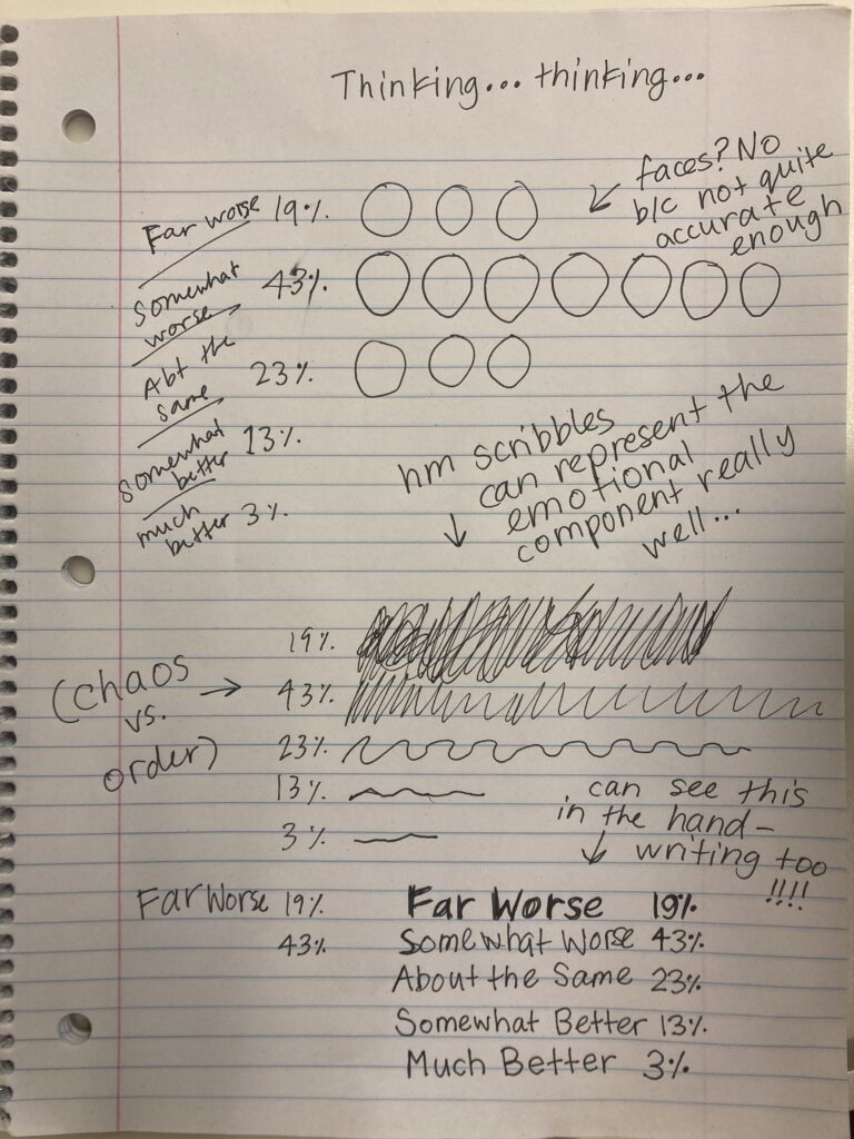
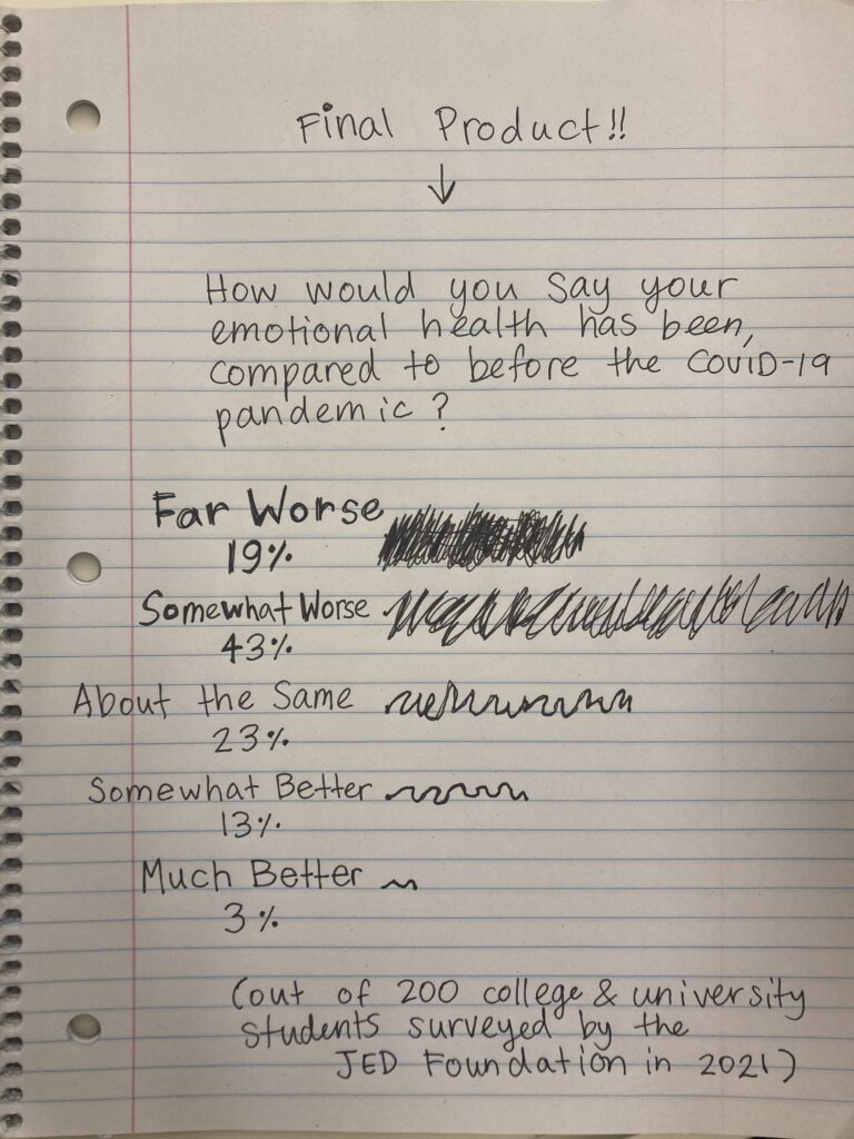
This tutorial helps you approach the process of making an interesting data visualization (graph, chart, pattern, image, etc.) by hand. We spent some time in this class learning how to visualize data with digital tools, but we never really took time to think about how you might approach making a data visualization through hand-drawing. However, we did look at some really wonderful examples of drawn data visualizations in class, like the work of artist @monachalabi on instagram. Her work inspired this tutorial.
Why should we try to make hand-drawn data visualizations when we could just use digital tools to make graphs? Although hand-drawn visualizations can (sometimes .. not necessarily, though) be less accurate, they can communicate a looseness and playfulness which can illicit more compelling emotional reactions from those viewing them. Being able to visualize data through hand-drawing is also cool because, if you develop the skill, you can create visualizations whenever you have a pen and paper, and this can be pretty useful when you want to quickly explain something to someone or demonstrate an idea.
The process —
1. Decide on the topic and data you want to represent.

2. Think about your statistics in relationship to each other — what about these statistics and the way they relate to each other is most interesting?
Think about size of the statistics: do the sizes of your statistics contrast, or are they very similar?
Think about the emotional/sentimental quality of your statistics: do the emotions evoked by your statistics contrast, or are they very similar?

3. Decide on some visual icons to use in your data visualization. What images and patterns do these statistics evoke for you? Think about icons that can represent the emotional qualities you identified in step 2, and also the size.

4. Map out a (fairly accurate) proportional representation of your data. Depending on your data, it might be helpful to use a ruler to measure out some boundaries for your drawing. You could also be a bit less accurate depending on how much time you are taking to make the visualization.

5. Once you have mapped out the proportions of your data, experiment with the visual icons and patterns you brainstormed to create a final image of your data visualization.


Here are some other resources which offer perspectives on hand-drawn data visualizations.
This is an INCREDIBLY COOL project in which two people mailed hand-drawn data visualizations detailing aspects of their everyday lives to each other on postcards. The project might provide some inspiration to you about how to use hand-drawn data visualizations in your life.
This site provides an alternative instructional tutorial and exercises for creating hand-drawn data visualizations. It is a bit more thorough than my tutorial! But it also includes different suggestions about how to approach the process. This makes sense, since hand-drawing data visualizations involves a lot of subjectivity.