Flourish is a website that makes data visualization easy and aesthetically pleasing. They do all the dirty work for you so all you have to do is organize the data. It is a great tool for when you need to represent data visually in unique and effective ways. It is great for presentations and digital humanities projects. This website is designed to be easy to use for beginners. There is not a steep learning curve to get familiar with the tools.
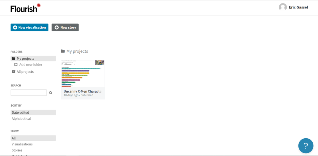
To get started, head to the Flourish website and create an account. You should then find yourself on a screen like this:

To get started on a project, click “New visualization” in the upper left corner of your screen.

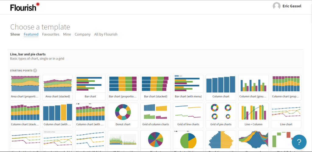
For this tutorial, we will do a bar chart race to demonstrate the cool types of graphs you can easily make with Flourish. Scroll down and find the bar chart race. Take some time to look at all the types of unique graphs you can make!

Click bar chart race. Then click data.

There’s a lot to digest on this screen. First, you can upload your own data sets by clicking upload data. I am more focused on the Flourish tools for this tutorial, so I will use the default data given. You can rename your project in the upper left corner. On the right side, you can choose which variables you want to plot where. You can choose multiple columns for certain values by using a dash to include all columns between certain ones. For example, here, we want the values to be the total population each year from 1960-2012, so D through ZZ represent all of these columns. If you didn’t want to include all of these years, you can write in columns separated by commas. The big question mark in the bottom right will take you to frequently asked questions and quick tips. Now, click preview (next to data).

Here, you can see what you graph currently looks like. On the right side, you can control visual aspects of the graph (as opposed to data aspects). This is where you have freedom to play with the graph visually. When you’re satisfied with your project, hit “Export & Publish”. Here, you will have options on how you want to export it. You can publish it and copy the HTML code to embed in a website like I did below.
This is something super cool you can do with the free version of Flourish. If you want to learn more, you can visit Flourish’s tutorial here or watch this intro video on Youtube. If you’re active in creating visual projects, Flourish may soon be your best friend.