Flourish is a web-based data visualization tool that allows users to create nice-looking, animated charts with minimal effort. Users can export the charts as images or embed them in their own websites. Flourish’s combination of customizability and usability offers a nice middle ground between the charts automatically generated by Excel or Google Sheets and coding your own visualization with JavaScript, Python, or R.
In this tutorial, we’re going to be making a scatterplot of Timberwolves players’ shooting percentages compared to number of shots they take per game. Ideally, we’d want the best shooters taking the most shots. This is mostly what we see.
Here’s the finished product before we start:
We get our data from basketball-reference.com. Let’s download it as an Excel file.

Now the fun part! Go app.flourish.studio and make a new account if you don’t have one already. Then, click ‘New visualization’ in the top left.

We’re going to use a scatterplot.

Next, go into the data tab and click ‘Upload data’. Then, select the columns you want graphed.

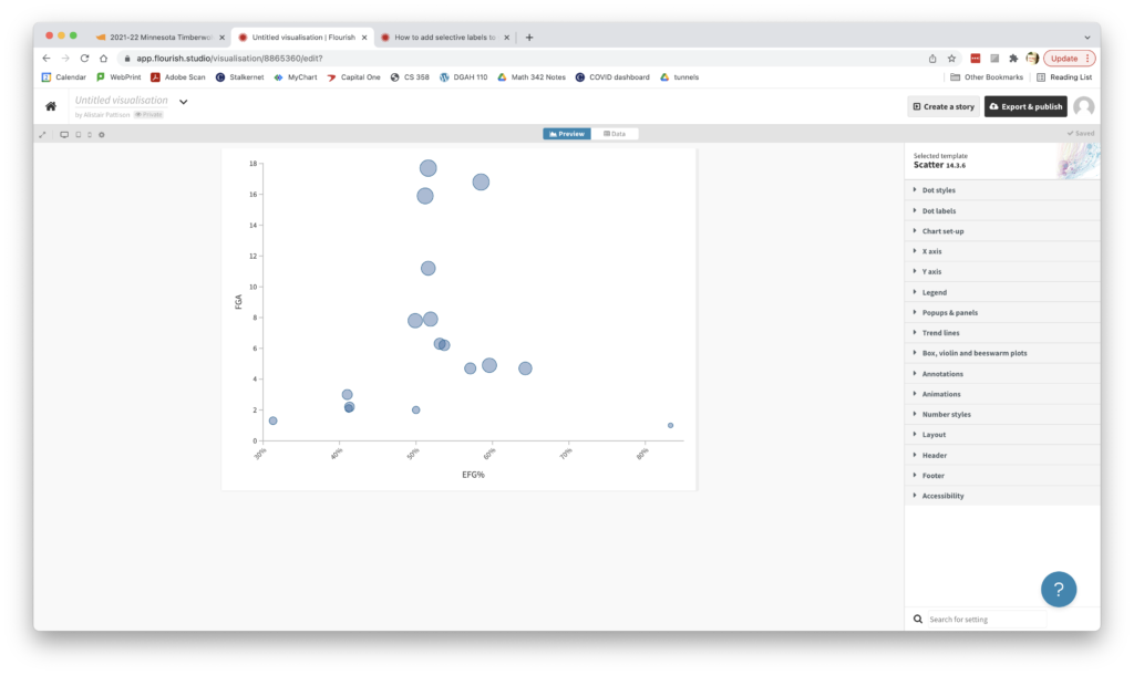
For this project, we’re going to display the shooting percentage (specifically EFG%) on the x-axis and shot attempts on the y-axis. Let’s also select the players’ names as the data points’ labels.

Et voila! We could stop here, but the plot’s pretty ugly. Fortunately, Flourish offers a ton of customization in the menus on the right. Let’s do some beautification.

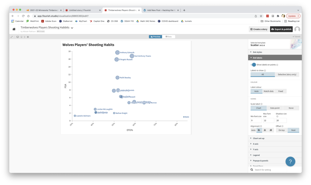
Much better. There’s less clutter, and the size of the points now corresponds to minutes played. But who’s who? We have to hover over the circles to see the players’ names. It would be nice if we could add point labels. Flourish does have a quick way to do that in the chart menus, but it quickly gets crowded. The points are too close together, the labels overlap, and you can’t read most of the names on the bottom half.

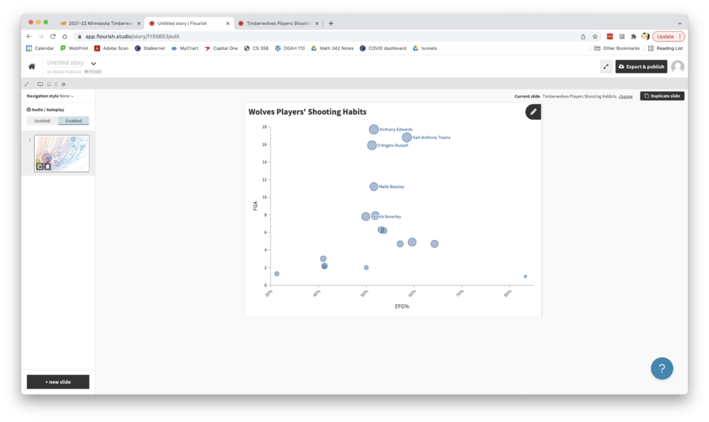
In order to label only specific points, we nee to make what Flourish calls a story. We do that by clicking the ‘Create a story’ button in the top right. In the resulting screen, we can click on individual points to show or hide their labels.

We could spend a ton of time fussing over minutia, but that’s good enough for now. Time to publish and embed!
For more inspiration, you can check out this gallery of visualizations made with Flourish. If you get stuck, the official help website is extensive! Good luck!

Great job with including screenshot for each step. Very easy to follow. The tool is also very useful.
As someone who has used Flourish, it is nice that it makes really nice graphs with minimal effort. Most of that effort (after getting your data uploaded) is setting up variables you want graphed. There is a lot of options in that step, and a little more explanation would be helpful for those following along. Otherwise, great tutorial!
This seems like an awesome tool. I’m familiar with other tools such as ggplot to make data visualizations, but this seems to be much more accessible while still maintaining a high degree of customization.
Easy-to-follow tutorial with short sentences (thank you, says my brain!). Also a big fan of flourish. It takes care of a lot of the logistics of setting it up so you can just focus on the creative aspect.
Going through the tutorial, the first part which requires to download the excel file was a little confusing since the link does not directly take the user to the datasheet rather I had to choose a player and then click on per game to find the data table. But overall, everything was clear and the screenshots were really helpful with following the directions.
I like that you included notes on customizing the design of the graph so that the information connected to the points is at the forefront. I think you made an important point at the end that there are many design elements that can be customized afterward, but the basic design of the graph is completed relatively quickly.