Here is the link of the website that I embedded my ArcGIS map of the population of squirrels and plants in the Central Park. This was my second time using ArcGIS web mapping including the first exercise which was integrating the Georeference tile layer onto the ArcGIS map. The integration of the Georeference showed a possibility of visualizing the old historical images on the modern map, and this assignment showed adding multiple layers to create a new insight on the map.
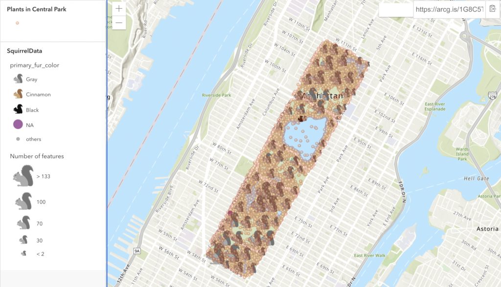
The primary data of this ArcGIS project is the population of the squirrels found in the Central Park (The original project by the NY Times can be found here). After adding the layer, I added some changes in style to distinguish the primary fur color of the squirrels. Then, I clustered the squirrels by the number of features on the map to display the points effectively. As a result, these customizations displayed the dominance of the grey-colored squirrels on the map.
After displaying the primary data, I searched up the second layer to add onto the map, and I personally thought this is a strong feature that ArcGIS supports. The data for the second layer was the population of plants in the Central Park, and I thought there might be a correlation of the locations of the plants and the locations (or the size of the clusters) of the squirrels. Although it was hard to determine the correlation just by looking at the points on the map, I was able to find some regions that were popular to both data points. I predict adding layers of different datasets would show clearer relationship between the two data.
The last part of the project was sharing the map, and the process was easy and smooth. ArcGIS provides many format options to publish, and I chose a web app. After publishing, the app provides an embed link that directly works on different websites. Overall, my experience with ArcGIS was intuitive, but I still felt that some UIs for customizing layers such as changing the style of points was not clear enough.