This week we are going to explore the basic principles, and some concrete examples, of data visualization. You might think that data viz is something only scientists and quantitative social scientists are allowed to do, but there are an increasing number of excellent resources for visualizing and analyzing qualitative data.
Today, we have a guest lecture by Lin Winton, director of Carleton’s new Quantitative Resource Center who teaches an entire course about data viz and will show us the ropes.
In Class-Exercise: Data Vizualization Dos and Don’ts
Following Lin’s discussion, read through the materials below discuss:
- The “reflection questions” from the exercises below
- The information from Lin’s lecture and how it relates to DH.
- What are some things you to keep in mind or to avoid as you consider data viz best practices for DH projects?
The Minard Map
It may well be the best statistical graphic ever drawn.
—Edward Tufte, The Visual Display of Quantitative Information (1983)
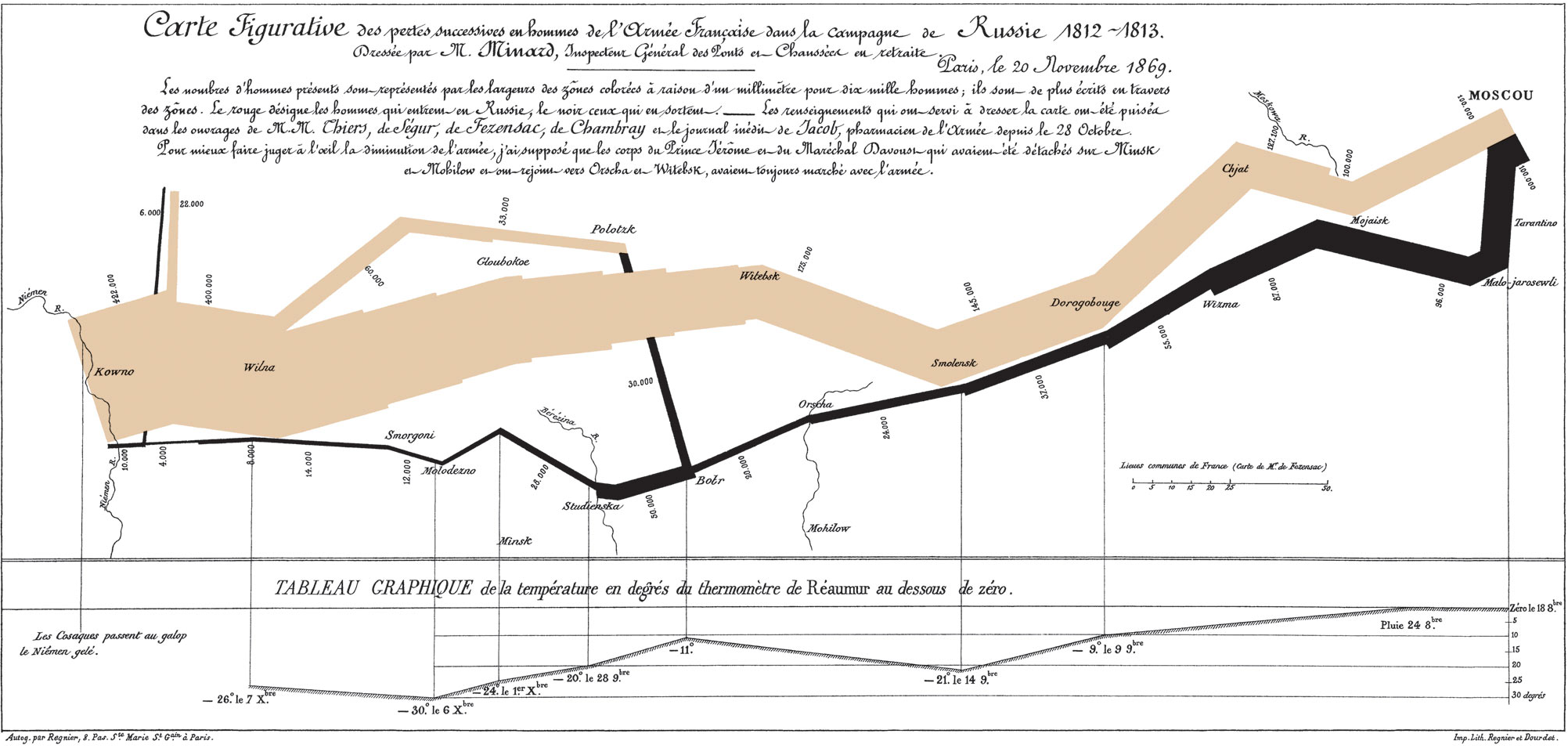
The Classic Discussed
This chart is famous for being a sterling example of data viz done right. In stark colors, simple lines, and minimal accompanying text, it not only tells a story, but offers an historical argument as well. Read the blog post below to be guided through the elements of the chart in an English translation.
- Michael Sandberg’s analysis on his DataViz History blog
- This is part 5 of a 10+ part deep dive series into Minard’s map. If you want more, see all the entries tagged Minard on his blog.
Does Minard’s map live up to the hype?
Do you agree with the glowing praise?
Improving(?) Minard’s Map
Even though it is often praised as the epitome of information design, many people have attempted to improve on Minard’s map. Explore one of the static or interactive variants below.
Is your version better/more informative than the original?
Static variants (Do they add anything?)
- Menno-Jan Kraak’s variant from his 2013 book Mapping Time (Figure 3)
- An annotated version by Michael Sandberg
Interactive variants (Does it help to be able to manipulate the map?)
- A custom coded instance at http://www.masswerk.at/minard/
- An instance using the Neatline plugin for Omeka
- And the developer’s discussion of his process on the Scholar’s Lab blog
Reflection Questions
- Why is this considered such a landmark visualization, if not the best ever?
- What are the key features that make it stand out?
- How would you improve on it, if you were to take a stab?
Keeping it Honest: How Not to Lie with Pictures
This may well be the worst graphic ever to find its way into print.
—Edward Tufte, The Visual Display of Quantitative Information (1983)
We’ve already discussed how not to lie with maps, but it’s easy to do with visualizations as well. One of the biggest issues that Tufte stresses in his seminal work is how to stay honest with infographics. One of the easiest errors to make, for instance, is to scale the radius of circles, or one axis of two dimensional shapes, which results in massively larger areas than your data actually warrants.
- Explore
- this gallery of images illustrating “The Lie Factor”
- Think about how the literal measurements of the images contradict the implicit argument the graphic is trying to make.
- You can also explore the r/dataisugly subreddit for some good examples of bad data viz
- this gallery of images illustrating “The Lie Factor”
- Explore some more of Michael Friendly’s gallery of the Best and the Worst of Statistical Graphics
Reflection Questions
- What mistakes did you not think of before that you might want to avoid?
- What examples might you like to emulate for your own projects?
- Why?
Animation (unlocking the 4th dimension)
As we think about data viz for historical topics in particular, it is often the case that animation provides the most intuitive way to visualize change over time. Below are some classic examples of animating data viz in order to tell a story or make an argument.
Isao Hashimoto’s “2053”
What story does this video tell?
What are the data?
Why is the presentation so effective?
Google Motion Charts (Gapminder)
One of the most impressive data visualization breakthroughs of recent years was Hans Rosling’s invention of Gapminder: an application that really unleashed the “fourth dimension” of time and allowed data to be animated in an immediately understandable and powerful way. His TED talk below illustrating global health data with the tool is legendary.
Google bought the technology and made it available for all to use as Motion Charts. You can use the API or create a Motion Chart from data in a Google Sheet.
Assignment Questions
- What new possibilities does interactive and/or sequential visualization unlock for DH projects?
- What, if any, are the drawbacks from visualizing data in “4D”?
Further Resources
We’ve already explored some easy entry visualization environments, but here are some more very impressive tools and languages to check out:
- Data Visualization Catalogue (that Lin Winton likes!)
- Tableau Public (an online visualization studio where you can upload your data and produce impressive, easily shareable data viz)
- D3.js (the current reining king of interactive online visualization)
- R graph gallery (R is a statistical package that generates very nice visualizations with very little code)
Choose one and check it out to see what people are creating.
In-Class Exercise: Exploratory Data Visualization Practice
We’re going to play around with a fantastic exploratory data visualization tool called Palladio developed at Stanford. This is a complex tool with a lot of functionality. The goal here is not to master it, but to figure out what it can do to help you critically interrogate your data and see what you should do to follow up.

In class, we will work with a very messy dataset of book images from the British Library that are on flickr.
- Download the dataset below from our shared google drive
I will walk you through the basic steps of using Palladio, but here are a number of great tutorials out there to dive deeper:
- Beginner: Getting Started with Palladio, by Miriam Posner
- More advanced: Critical Data Visualization with Palladio, by Matthew Lincoln
- Tutorial Docs: Tutorials & FAQs on the Palladio site
Assignment: Cleaning Data with OpenRefine
OpenRefine is like a spreadsheet program but with extra special features that let you perform batch operations to clean data and turn messy OCR’d or scraped text into nice regular tabular data.
Work through the steps below to clean a version of the dataset and save it in your common folder before next class
Here are the data manipulation tasks we will take with OpenRefine
- Clean up spelling inconsistencies
- Remove extra white space
- Format dates and numbers using regular expressions
- Extract and combine values
Note: Extracting Text from PDF
We are starting with table data here, but many projects will first need to pull data from PDF files using Optical Character Recognition. There are many ways to get OCR’d text out of a pdf, from APIs to python utilities to copy/paste. If you are on a mac, one of the easiest is to set up an automator script to generate output from any PDF you drop on top of the application.
1. Install OpenRefine
Head to www.openrefine.org/download and download OpenRefine. It’s available for Windows, Mac and Linux
NOTE: If you’re on a Mac and, when you try to open OpenRefine, you get a message saying that you can’t open software from an unidentified developer, do the following: right-click the program and choose Open, then click Open again.
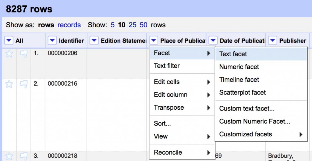
2. Download our sample data
We are going to be using a sample dataset developed for an “Introduction to OpenRefine,” tutorial developed by Owen Stephens on behalf of the British Library. We will use the same data, but do slightly different things with it today.
- Download the data from github here
BL-Flickr-Images-Book.csv - Save it to your hard drive as a .csv file to import into OpenRefine
3. Clean data in Open Refine
We will walk through the steps together but this is what we are going to do, along with some text you’ll need to copy and paste to get going
- Import the data, accept the defaults (but consider the options) and Create Project
3a. Clean inconsistencies in text columns
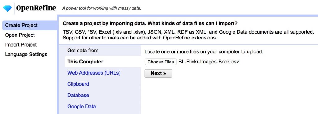
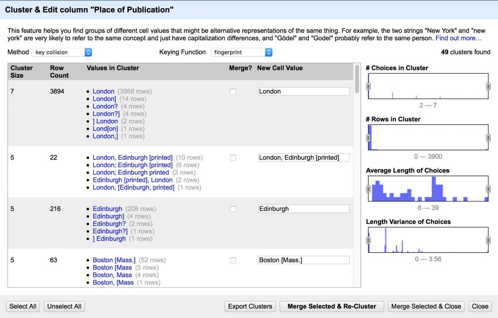
The Place of Publication field is messy and contains many references to the same place with slight spelling and punctuation variations that humans will ignore but computers will be confused by. We’re going to clean them up.
- Create a text facet on Place of Publication field following the image below
You should see a list of all the unique values with counts of how many times each appears in the dataset. Note the range of strange values in what should be a list of geographic locations. We’ll start to clean them using Open Refine’s powerful clustering algorithms.
- Cluster the Place of Publication facet to clean up inconsistencies
- Review the suggested clusters, choose the best New Cell Value, Merge Selected & Re-Cluster
- Repeat until most clusters are resolved
- Change the Keying Function to another algorithm and see if you can refine further
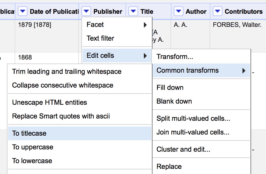
3b. Clean formatting junk in text columns
Many computer programs will treat capitalization and whitespace as significant differences, where a human normally would not. We can clean up these errant values using Common Transforms.
- Use Edit Cells > Common Transforms to
- Convert all values in Publisher field to Title Case
- Trim leading and trailing white space
3c. Clean and transform numeric/date data for visualization
In order to plot a time series on dates, or have the computer count numbers, we need to transform our data to valid data types in those fields. OCR’d text often has errant characters that read as text instead of number or date. Let’s fix that using both custom text transformations and regular expressions.
- Create a text facet on Date of Publication
(we can’t use a numeric or timeline facet yet because of all the non number characters in this column “[]?” etc.)- Cluster Date of Publication
- Select All, Merge Selected & Recluster
Now we need to clean up the non-date related characters using regular expressions.
Regular Expressions
Regular Expressions are a fantastically useful tool to match patterns in text to do advanced find, replace, and extract operations. They are implemented slightly differently in many different applications, but here are some general resources to get you started.
- RegExr is a great browser based tool to learn and try out regular expressions, much like paste bin sites like jsBin or CodePen that we’ve used for HTML, CSS and JavaScript
- Understanding Regular Expressions lesson from the Programming Historian
- A great introduction to the power of regex using advanced find and replace in LibreOffice
- Cleaning OCR’d text with Regular Expressions lesson from the Programming Historian
- A next level up in regex use, writing a python script to parse messy OCR’d data
- Regular Expressions cheat sheet from the TextMate text editor
- A handy go to guide for the most commonly used regular expressions
In Open Refine, we’ll use the value.replace() function for this. First we’ll remove the second bracketed date in values that contain two like like: “1879 [1878]”
- On the Date of Publication column, go to Edit Cells > Transform
- Make sure the Language field says General Refine Expression Language (GREL) and copy/paste the following regex expression in the box
value.replace(/\s\[.*\]/,"")
This substitutes nothing (“” the value after the comma) for any value matching the pattern between forward slashes “/” before the comma; in this case:
\s     any whitespace character (space, tab, etc.)
\[     an open square bracket (escaped by the backslash)
.*     any characters (the * means 0 or more of the preceding)
\]     a close square bracket (escaped by the backslash)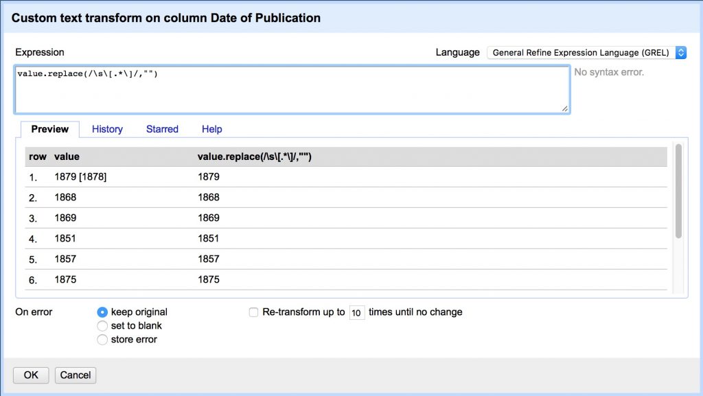
Now lets do it again to remove any of these characters “[].?” wherever they appear individually. We do this by using unescaped square brackets to form a “character set” and match any character within it. Note we have to escape several with backslashes because they have special meaning in regex.
- First, Date of Publication > Sort with options as text, a-z
so that all the bracketed values show up at the top of the list. - Date of Publication > Edit Cells > Transform… and copy/paste:
value.replace(/[?\.\[\]]/,"")
[      open character set
  ?      match "?"
 \.      match "." (escaped by the backslash, otherwise means any character)
 \[      match "[" (escaped by the backslash, otherwise opens new set)
 \]      match "]" (escaped by the backslash, otherwise closes new set)
]      close character set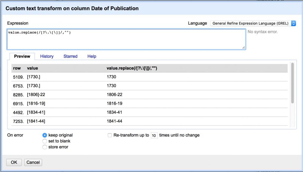
- Sort > Remove Sort to revert to the original order
Some rows contain date ranges, rather than single dates. We would ideally preserve these ranges by making a new End Date column, but the data are messy enough that we will compromise here by making Date of Publication contain only the first full date listed.
We’ll do this by using a capture group to isolate the date. Putting parentheses “()” around a pattern “captures” it and allows you to recall the captured group later, with a numbered variable like $1, $2 for the second captured group, etc.
- Date of Publication > Edit Cells > Transform…
- Copy/paste the following
value.replace(/(\D*)(\d{4})(.*$)/,"$2")
()     capture group for extracting substring or backreferencing
\D*    any character that is NOT a digit (* means 0 or more of preceding)
\d{4}  any digit character 0-9 ({4} quantifier matching 4 of the preceding)
.*$    any character (* means 0 or more) to the end of the line ($)
This regex captures three groups and replaces the current value with only Group 2, referred to in GREL by “$2”.
- Group 1: any non-digit characters at the beginning, e.g. “printed “, “c “, etc.
- Group 2: the first 4 digit date, the value we want to save
- Group 3: any additional characters after that date, e.g. “-1898”, “, 04”, etc.

Finally, we’ll remove any remaining values from the column that are not a simple 4-digit date, using the .match function which returns an array of any captured groups, from which we’ll grab the first value by appending its index number, [0]
- Date of Publication > Edit Cells > Transform…
- Copy/paste the following
value.match(/.*(\d{4}).*/)[0]
()     capture group for extracting substring or backreferencing
.*     any character (* means 0 or more of preceding)
\d{4}  any digit character 0-9 ({4} quantifier matching 4 of the preceding)
.*     any character (* means 0 or more of preceding)
[0]    returns first value in array

3d. Split values and merge columns
Sometimes values end up in the wrong columns, since characters that were supposed to split values — like the comma in a Comma Separated Values sheet — were not recognized.
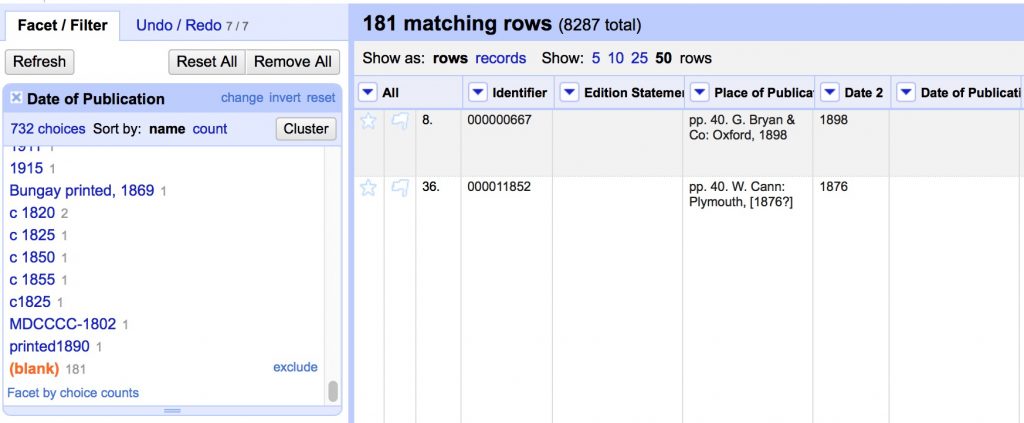
If you look back at our Place of Publication facet, you’ll see it erroneously contains a number of date values, many of them following commas, while the Date of Publication column contains 183 blank rows missing their dates.
Row 8 of our sheet is one clear example, where the date value is in the wrong column

We can use the same .match regex expression above to pull out the date values and put them in a new column, which we can then merge with the existing Date of Publication.
- Place of Publication > Edit Column > Add column based on this column…

- Set the New column name as “Date 2”
- Copy/paste the same regex expression we just used
value.match(/.*(\d{4}).*/)[0]
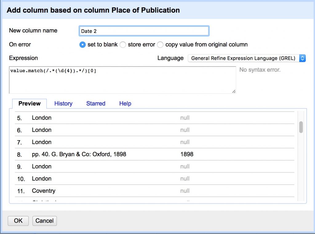
You should have pulled 184 missing date values out of the Place of Publication! Now we just have to merge them back into our original column.
- In the Date of Publication text facet, click on (blank) to see all matching rows
With these rows selected, any transformations we apply will only affect the matching rows and not other values. This time we’ll use the cells object to pull values from one column into another.
- Date of Publication > Edit Cells > Transform…
- Copy/paste the following
cells["Date 2"].value

Almost there! Now we just have to clean up our process mess before we can export.
- Click Reset All in the Facet/Filter tab to restore the view to all values.

And now we can delete the Date 2 column, since it’s values are preserved in Date of Publication
- Date 2 > Edit column > Remove this column
Export from OpenRefine
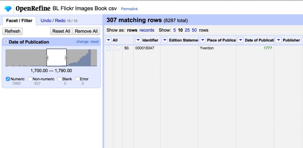
Big datasets are tough to work with, so you can use facets to shrink your dataset. Here we’ll show exporting just the books published between 1700 and 1790, but the same principles apply to any facet you might create.
- Use Edit Cells > Common Transforms > to number on the Date of Publication field
- Use the number facet on the Date of Publication column to select a range, and uncheck Non-numeric and blank.
- Choose Export in the top right, and download as CSV
CONGRATULATIONS!! You’ve cleaned up all the data columns and gotten pretty clean data.
- Save your export in your google drive named folder and we’ll play around with it in Palladio next class
OpenRefine Resources
There are a lot of great resources for getting started out there, but here are a few to get you started.
- Miriam Posner’s introduction to OpenRefine
- A basic introduction to the tool, that will give you the key features for working from messy data that is already in a table
- Cleaning data with OpenRefine lesson from the Programming Historian
- A more in-depth exploration including using the GREL language to do more advanced programmatic cleaning
- Fetch and Parse data with OpenRefine lesson from the Programming Historian
- A power application that uses GREL to fetch URLs and parse web content into csv files