Flourish is a data visualization tool that has a variety of interactive graphs and maps. In addition to specialized methods of viewing the data such as a population pyramid for breaking down population statistics, more traditional types of graphs such as bar charts and scatter plots are also available. This array of forms to break down and compare data is helpful for highlighting patterns and illustrating a narrative. Since these templates are specialized for specific forms of data, you have to structure your metadata so that it conforms to the tool’s requirements. For example, to build a map, you have to have locations listed in a column and for a bar chart, you have to have the quantities listed in a column. Once you have chosen the method of visualization, there are further customizations available such as what information is shown in the visualization depending on the selected columns. These specific and customizable methods make the process of understanding the data easier for the viewer and they make a more visually appealing presentation. The tool I will be guiding you through in this tutorial is the packed circles template. This is especially helpful in visualizing groups and their corresponding connections within a set of data.
Here is the Flourish tool.
When you get to the website, this is what the front page looks like:

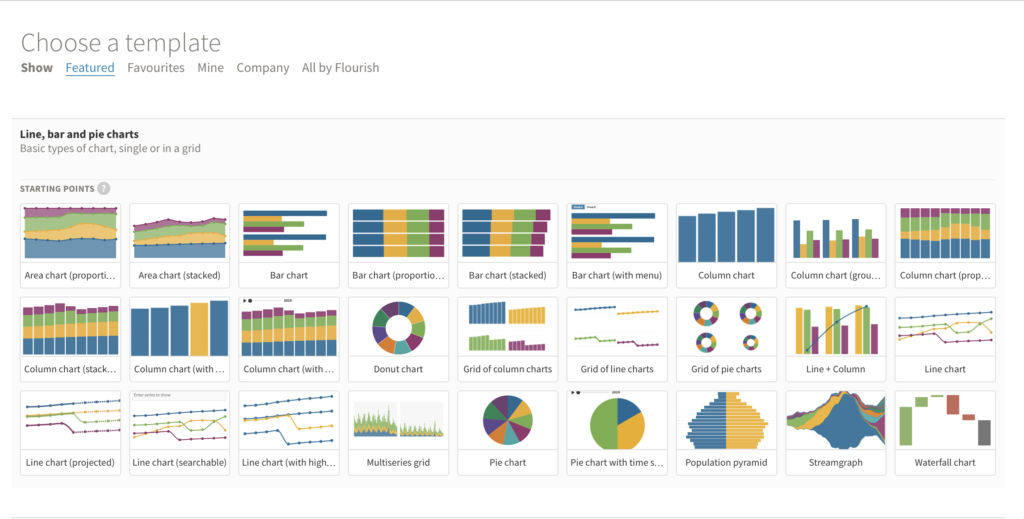
The first step is to sign up for a free account. Once you have signed in, many different visualization sources will be available. Keeping in mind what type of data you are trying to render visually, you would select one of the templates. Below are some of the most common templates: line, bar, and pie charts.
This next image shows some of the possible tools for visualizing spatial information. If you continue to scroll down, you will find even more varieties of visualization.

The packed circles template, which I will be using for this tutorial, is under the hierarchy section.

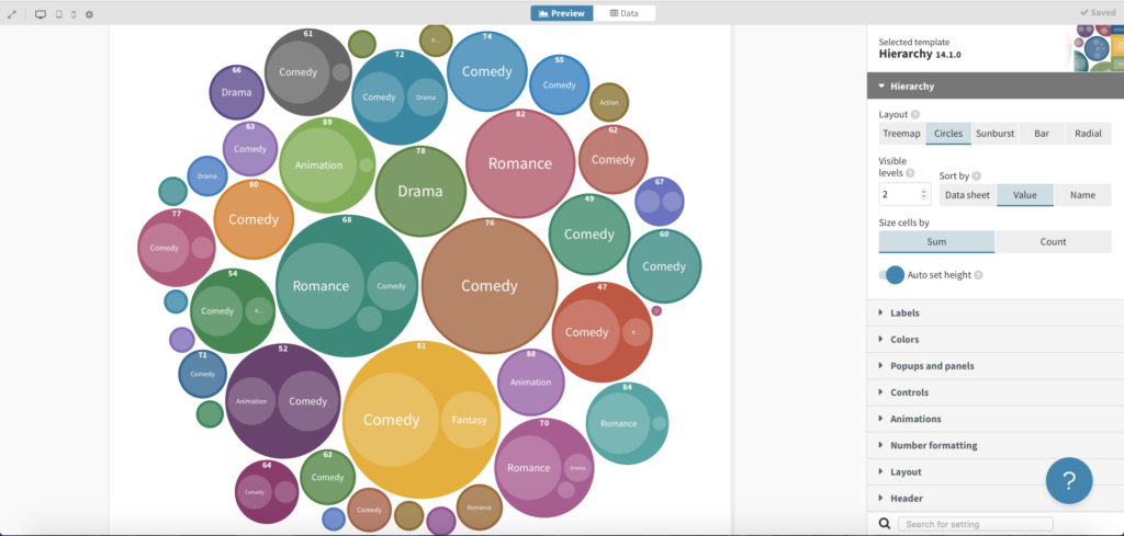
When you open the template, there is already sample data in there for you to use and play around with. The first view you get is the preview of their already imported data.

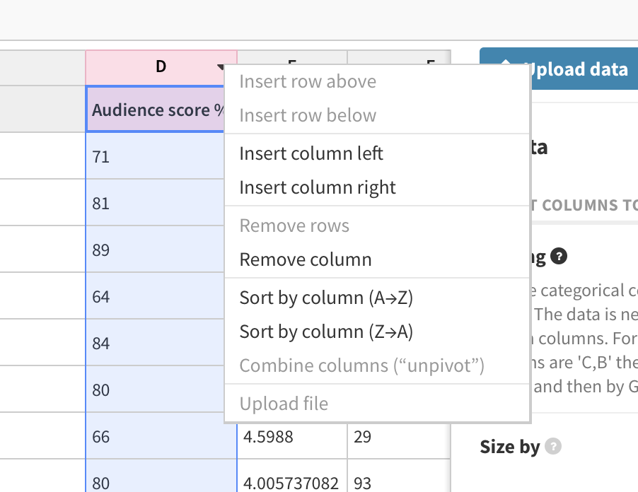
If you click on the data button to the right of the preview button, you will see the columns and rows of information. The data that is already imported into this template is information on different films, such as their genre and lead studio. You can add, delete, or edit the columns and rows here. In the top left hand corner, you can name your project.

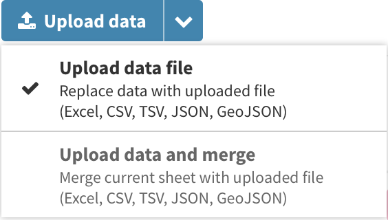
To the right of the graph, there is a blue button where you can upload your own data.
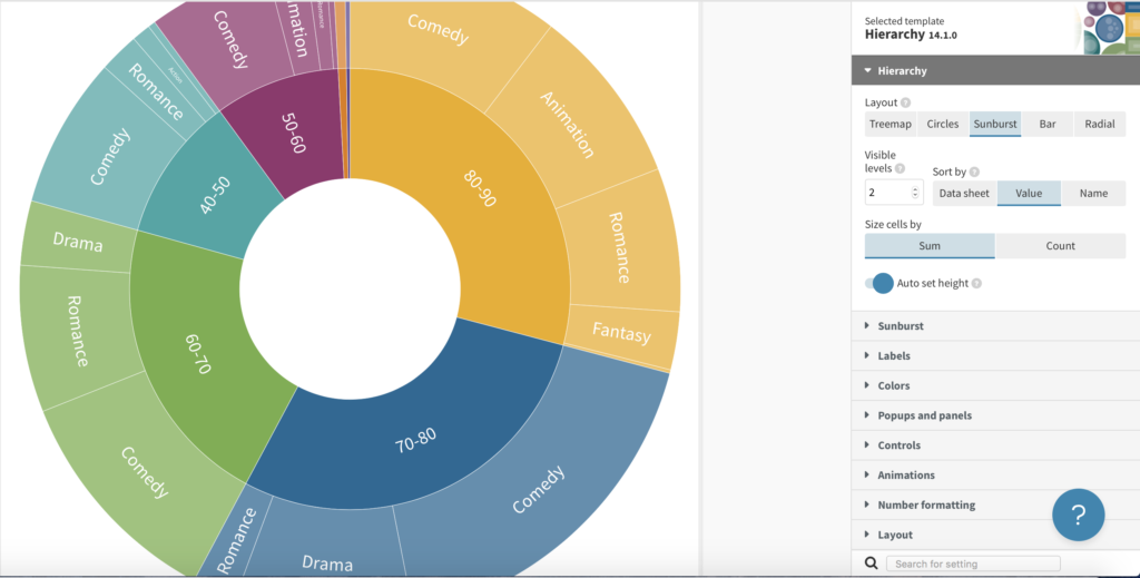
Below the upload data button, there are four colored boxes where you can choose which columns are represented in the visualization by entering the letters of the columns. Right now the size of the circles is represented by the column titled Worldwide Gross. The letters in the pick squares indicate which columns are being nested. The column listed to the right is nested within the column to the left. This means that films are being grouped by their genre and then by their lead studio. If we select different columns, the visualization will change. If we change the pink boxes to contain D,B-A, the films will be grouped by genre and then audience score.

You can add additional columns and adjust the way the data is grouped. For example, by grouping the audience scores by units of ten, the groupings become larger.

The updated visualization will appear after pressing the preview button.

You can change the data, both what and how it is represented. If you look to the right side of the visualization, there are many options for customizing the design of the grouping, including changing the type of hierarchy template, as shown below.
The final step is to export your visualization by pressing the black button in the top right hand corner.

Since one of the uses of data visualization is drawing out a narrative, Flourish also gives you the opportunity to create a story with your visualizations. If you want to learn more about that, here is the tutorial Flourish has created. Another useful tutorial that Flourish has created is on how to choose the right visualization for the data that you are using. That tutorial can be found here.
This is a great tutorial with some really helpful images! I had some trouble understanding how the nesting and stuff worked, but because you had images that clarified what you meant and provided example scenarios, I was able to understand nesting order and specifics like that. I would say that the organization and sheer number of images was a little intimidating, but that might just be an issue to be resolved with formatting things.
The storytelling capabilities from this make it a super interesting tool. The nesting part was a little confusing, but the images helped a lot. I think I would have understood it more if it was in video format.