Here is a link to my embedded map!
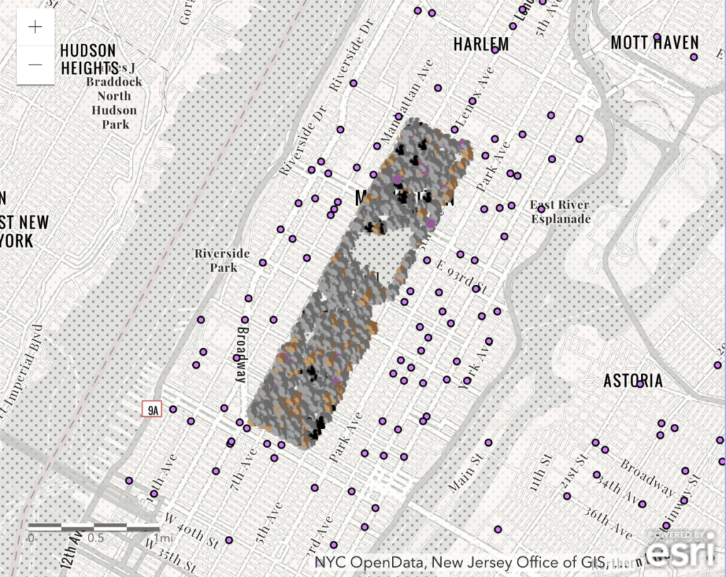
When we did the georeferencing lab, I was not convinced about the potential for online mapping software as it felt very laborious to make a map. However, after going through this process, I now see limitless potential for ArcGIS. In terms of making my map, I found the process to be intuitive and similar to other projects we have worked on in this class as we just open up a CSV file and modify it from there. Besides the squirrel layer, I also included a mapping layer of all grocery stores in NYC from the community layers to see if there is any correlation (unfortunately, there is not). Moreover, there are many other layers from the community layers, that can be used to potentially visualize more data. The squirrel and grocery store example was an amusing way to get accustomed to ArcGIS, but one could also have done something such as comparing population density and grocery stores. Finally, in terms of my process, I actually had trouble finding the embedded HTML, and I had to remind myself how to edit my site again which was an unexpected roadblock. Also, I wish there was a way to center the map because it is zoomed out at the moment.
Overall, I could see many different uses with ArcGIS in a wide variety of disciplines. It appears that ArcGIS is used at Carleton to map the arb, and Austin has used to map colonial Boston. I wonder when mapping “map data” is not a good idea, and how is data accurately collected?
Hi James, I love the grocery store layering idea — I’m bummed that there isn’t a correlation to squirrels. That was a very sound hypothesis