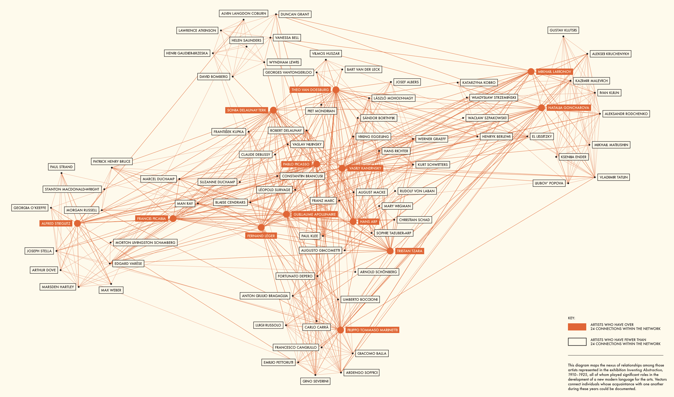
For this blog, I chose to analyze the network of early 29th century artists which was created for the Inventing Abstraction exhibition at the Museum of Modern Art in New York in 2012 and 2013. The graph depicts artists who were influential in the creation of the abstractionist movement and edges connect artists “whose acquaintance with one another during these years could be documented.” It is unclear where they got this information, but I assume that because this was a prominent exhibit at a well-regarded museum, that they did their own research to determine connections. Popular artists (who the museum defines as those who have more than 24 connections) are highlighted red.
The site allows some interactivity. Hovering over someone’s name causes it to become highlighted and all edges connected to the person become thicker so you can more easily see the connections. I liked this feature; it was sometimes hard without the edge highlighting to see who was connected with who because there is so much going on in the graph. I think this clutter was intentional to show the interconnectedness of the field and to emphasize that art is not a solitary endeavor, but I appreciate that the creators allow a way to thin out the graph when you actually want to examine the individual data points. You can also click on a person’s name to bring up a subgraph of only those who are connected to the chosen person and little pop-up window which shows the artist’s birthplace, areas of interest, and famous works. I found this useful when trying to see who was connected to Claude Debussy, who I didn’t realize was a part of this movement.
As noted earlier, the authors don’t provide a lot of information on how the product was created. It clearly uses JavaScript, but whether or not they used any libraries or off-the-shelf services is unclear. The project does list people from Columbia business school as collaborators, and some digging revealed that they had recently published a paper on the impact of author’s social networks. I would guess this is where the data came from, even if not explicitly cited.
Highlighting all the connections is definitely one of the simplest/best features I’ve seeing on these projects.