This is the link to my embedded map page on my site.
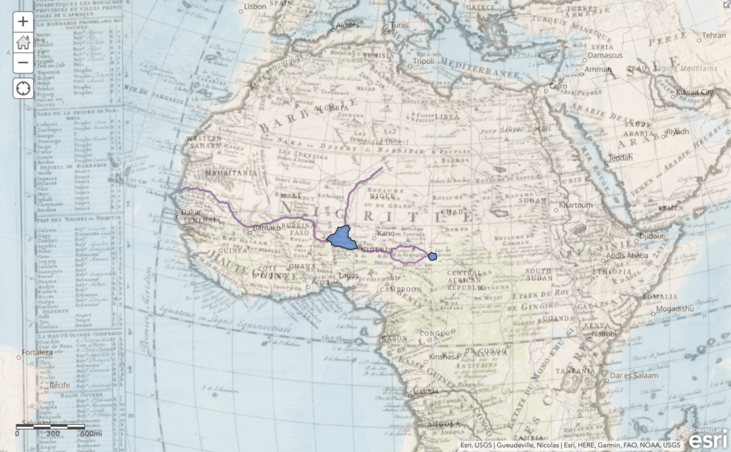
I have a lot of fun adding lines and areas to my map and comparing it to the actual world map. I am surprised to see how the rivers and lakes marked in 1720 disappear in the current map. It definitely shows how the geographic feature of Africa has shifted during the 300 years. Yet when I am adding this map to my personal website, I cannot show the annotated rivers and lakes. Also for the squirrel data, I add the NYC subway data and the safe street for senior data. When I am browsing through ArcGIS Online, I am excited to see how different data can coexist in the same map and show different information. With the right dataset, I believe it is a great tool to find any correlations between different datasets and I am looking forward to exploring this in my own project later.
I like the polygons and lunes that you drew on the Africa map! I hadn’t thought of representing different data on the same map to see how they coexist, now I am intrigued by this idea. Finally, I think that you do a good wrap up with what ArcGIS is able to do for us by mapping the data so we can try to fins correlations, scatterplots beware.