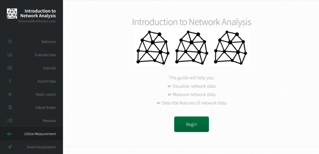
The project that I chose to explore is the Introduction to Network Analysis by Thomas Padilla and Brandon Locke. Based on their personal websites, Thomas Padilla is a senior director at the Center for Research Libraries, and Brandon Locke is a project manager at Educopia Institute. This website appears to be a personal project by Padilla and Locke.
This is a step-by-step guide of conducting network analysis in Gephi. Because the nature of a network analysis is about modeling relationship and/or interaction between various subjects, the example data used in this project contains information on scholars in the fields of humanities and digital humanities, their works and related institutes. A node could be either a person, a panel, a paper, a poster/demo, a pre-conference workshop, or an university. An edge is a directed edge connected two related nodes. The website does not specify how the relationships are characterized and categorized, but I assume that an edge between two nodes represents some sort of professional connection between the them. For instance, the scholars are connected to the papers they published and the schools they worked in.
The project also introduces a number of metrics for analyzing the graph and visualizing the graph in numerous ways. Some example metrics include average degree, network diameter, graph density, and eigenvector centrality. One can apply these metrics to the graph and visually compare them across nodes.
Sadly, the project does not allow much interactions with the graphs. The website simply contains some non-interactive images showing how to realize certain functions in Gephi. The only interactive part of the website is the navigation buttons.
This project does not appear to combine network analysis with any other information or technique. After explaining how to utilize different measurements, the project continues to discuss how to share visualization.
According to the footer of this project’s website, the website is built with HTML5 UP and the network icons are from Brennan Novak.
Hi Jeanny! I enjoyed reading your post! I also wrote on my post, but I agree that this project didn’t really show further interpretations of the example data. I assume it was more like an introduction to a visualization software rather than a visualization of a subject using a software.
I really like you post since it is totally different from the project that I did. I think it’s really interesting that instead of analyzing a digital humanity project that most of other people including me did, the project that you chose is learning a guide. I really enjoyed reading you analysis and learning about Gephi in your blog. Nice post!