Most 21st century Americans are likely not strangers with the utility of Google, and Googling unfamiliar phrases we encounter, things we suddenly would like to see out, and reaching for other curiosities is an experience many of us share. Like me, you’ve likely pulled out your phone under the table to Google an unfamiliar cocktail or opened Chrome to search for a recipe many times. What about the time, season, holiday, and our culture prompts us to do so?
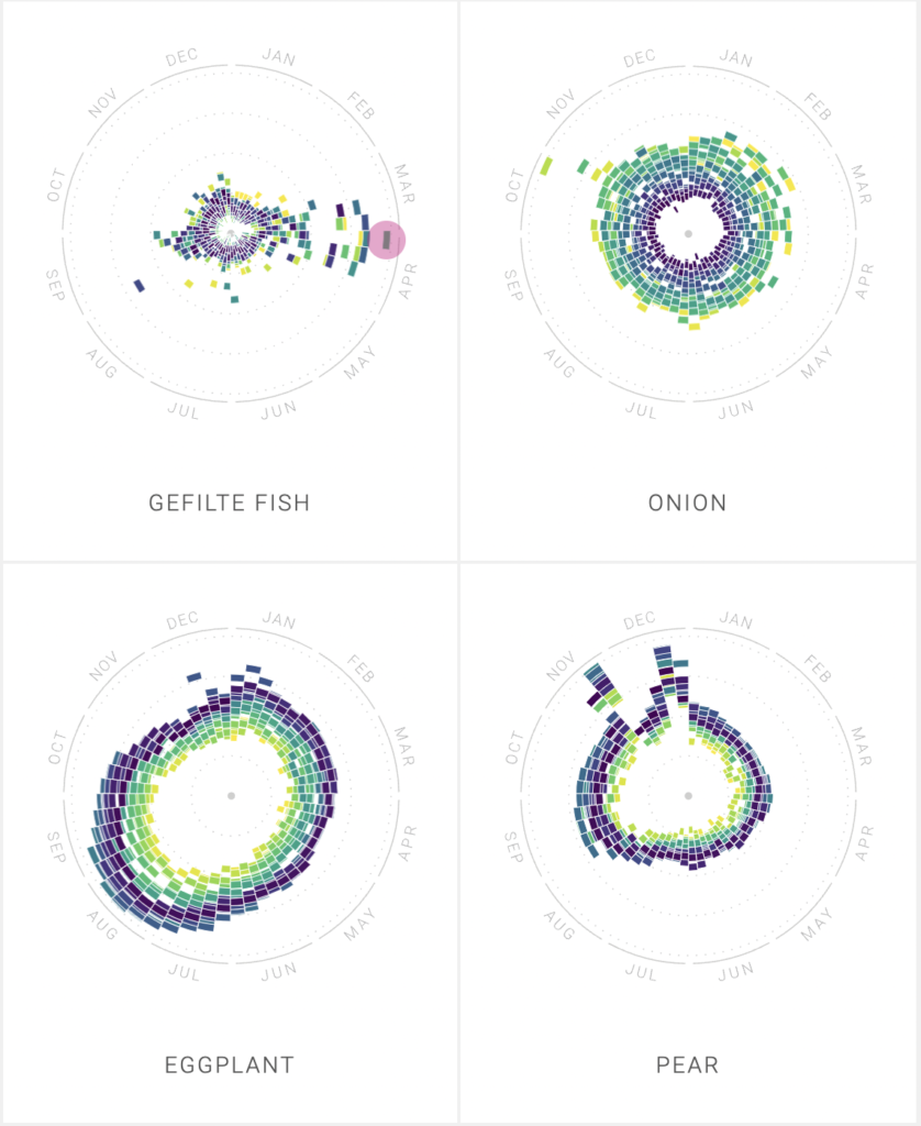
Researchers at Google News Lab and Truth & Beauty created The Rhythm of Food, where users can explore and interact with colorful “year clock” graphs mapping the search patterns of different food-related topics.
Using FooDB—which hosts a 797-item-long list of edible ingredients and dishes—as a starting point for subjects, the creators analyzed “hundreds of ingredients, recipes, and other food related search terms” with Google Trends from the United States. Google Knowledge Graph allowed them to differentiate food-related items from other trends (Apple computers from apples, the fruit). The project grew to encompass 201 topics, ranging from key words like “diet” to cocktails like “Daiquiri.” The aim of the project was to “investigate the seasons and rhythm of food,” which the creators accomplished by choosing a circular graph shape so colorful and easy to picture that one can easily discern an almost rhythmic pattern to our curiosities. Accordingly, the information is explained and then presented in a way that is simple enough to appeal to someone with little coding or humanities experience.
I would like to see what this project would reveal about cultural trends or differences if expanded to include Google search trends from other countries or made specific to US states.
The Anatomy
Sources: Google Trends from the United States from the last 15 years, using FooDB as a starting point. The current site “comprises 201 topics and presents 155,705 individual data points.”
Processes: Plotting Google Trends data for over 15 years on “year clock,” then tagging topics with categories (months, holidays, seasons, etc.) they fall into. Years are labeled by differently colored blocks and the radius is calculated by the number of searches. They used Google Knowledge Graph to find more accurate results.
Presentation: A color coded round “year clock” makes it easy to recognize patterns and shifts in attitudes towards specific foods. To make the images Website users are able to sort by types of dishes, popularity during different seasons, and other categories like “special occasion” and “charts that look like the food.”
Love the consistency of onions! Definitely a staple my diet year round.
It would e cool to see if you could see foods that have similar trends- maybe with a correlation metric.
I agree with the idea that the year clock was a good way to show the results of the google search trend. The patterns were easy to recognize and fun to look at, and even great to see if any of the patterns resembled the corresponding food!
I also investigated the Rhythm of Food! I love your post, it is so well-articulated. I was particularly interested by their use of Google Knowledge Graph, which allowed them to differentiate certain terms such as “Apple”, the company, from “apples”, the fruit. It wouldn’t even occur to me to include this specification, but it would certainly skew the data if they included all search queries for the overall term “apple”!